Showing posts with label architecture. Show all posts

4.29.2010

I'm back from my hiatus...things got way too crazy busy and my computer crashed. I hope to post more frequently now.
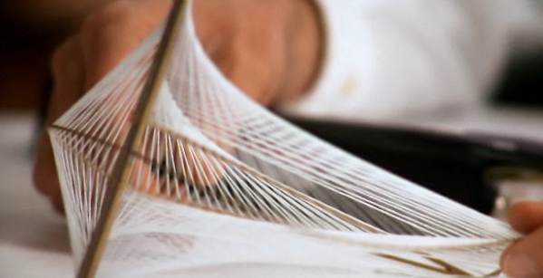
I just heard that architect Santiago Calatrava will be collaborating with the NY City Ballet this season. If you have the chance you should try and get tickets for these performances, I'm sure it'll be well worth it. Check out this link for more information and to see a short video on this project.

On a similar (architectural) note, I was going through my notebooks where I collect photos of patterns or color combinations I like and I came across these:
I believe this is by Mario Botta and the church is San Giovanni Battista in Mogno, Switzerland. See some beautiful images of this church here.

This is the Hilton Hotel in Athens, Greece, designed by Vassiliadis, Vourekas and Staikos.

2.08.2010

There's an interesting website worth looking at called 100 Abandoned Houses. It shows just that, 100 or so images of different abandoned houses. I think most (if not all) were taken in Detroit. This image was one of my favorites.

8.14.2009

PATTERNS IN CHURCHES


I saw some interesting patterns in many of the churches I visited in Tuscany. The columns are from San' Antimo, a church an hour away from Siena. Each column has a different pattern along the top. The church overall is quite austere, but it's filled with small details such as these.

The bottom two images are of the ceiling in Santa Croce (in Florence). Who says you can't combine different patterns?

8.11.2009

BACK FROM HIATUS


Now that my summer travels are over, I should be back to more regular postings...
I flew Swiss Air to Italy and couldn't believe how faithful they were to swiss typography. All of their branding (from in-flight magazines, sugar packets, utensils, to their barf bags!) was beautifully consistent. Yes, it wasn't ground-breaking, but props to them for keeping it clean and very swiss! They use a tick (-) to mark headers and use the red cross as a pattern, as seen on the back of the chocolates' packaging (2nd image from top).

The 3rd image is of some after-shave lotion. Although it doesn't scream grooming product, it still has a nice aesthetic.

The last image is of a building in Florence. I loved the fake window painted in the middle!

More images to follow soon...

6.22.2009

I walked through the High Line last week. It's really wonderful, here are some pics...

The road to nowhere.


Some cool patterns and color schemes. Go see it for yourself!